🎨 The Power of a Neutral Color Scheme with Warm Undertones in Interior Design
How to Create Cozy, Timeless, and Elegant Spaces
By Er. Faisal Qureshi – Certified Interior Design Consultant
Published on UpNextLiving.com | Updated: May 31, 2025
🧠 What Is a Neutral Color Scheme with Warm Undertones?
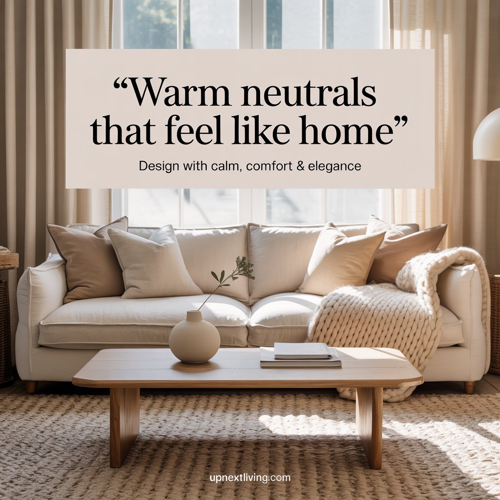
In interior design, neutral colors refer to shades that don’t appear on the traditional color wheel—think white, gray, beige, and taupe. But when these neutrals carry a warm undertone—such as a touch of yellow, red, or orange—they transform spaces with an added sense of comfort, depth, and livability.
🔑 Key Characteristics:
- Soft, earthy vibes instead of stark contrasts
- Colors that reflect natural light beautifully
- A backdrop that feels inviting, not sterile
Warm neutrals create spaces that feel like home — making them perfect for living rooms, bedrooms, and even kitchens.
🎯 Why Use accent neutral color scheme in Neutral Interiors?
Neutral schemes have always been popular, but adding warmth elevates them by making your home feel more lived-in and personal.
✅ Benefits of Warm Neutrals:
- Soften harsh lighting and create an inviting glow
- Blend easily with wood tones, natural fibers, and greenery
- Work beautifully with both modern and classic aesthetics
- Make spaces feel less clinical and more welcoming
Warm tones mimic the comfort of nature — sand, clay, and sunlight — which calms the nervous system and supports wellness.
🎨 Examples of Popular Warm Neutral Colors
Here are some paint and decor tones commonly used in warm neutral schemes:
| Color Name | Description | Ideal Use |
|---|---|---|
| Soft Beige | Warm, sandy neutral | Living rooms, hallways |
| Greige (Gray + Beige) | Balanced mix of warm and cool | Walls, cabinetry |
| Cream White | White with yellow undertones | Ceilings, trims, kitchens |
| Terracotta Tint | Earthy, subtle orange base | Accents, rugs, textiles |
| Mushroom Taupe | Gray-beige with warm undertones | Bedrooms, sofas, large walls |
🛋️ Where to Use Warm Neutrals in Your Home
🛏️ Bedroom:
- Use warm-toned linens and taupe paint for a restful retreat
- Add wood accents and soft lighting for a cozy feel
🛋️ Living Room:
- Choose a greige or warm ivory sofa, layered with wool throws
- Combine with terracotta decor or oak furniture for contrast
🍽️ Kitchen:
- Consider cream cabinetry paired with brass hardware
- Use stone or quartz countertops with beige veining
🛁 Bathroom:
- Use sand-colored tiles and linen shower curtains
- Incorporate wood vanities for natural texture
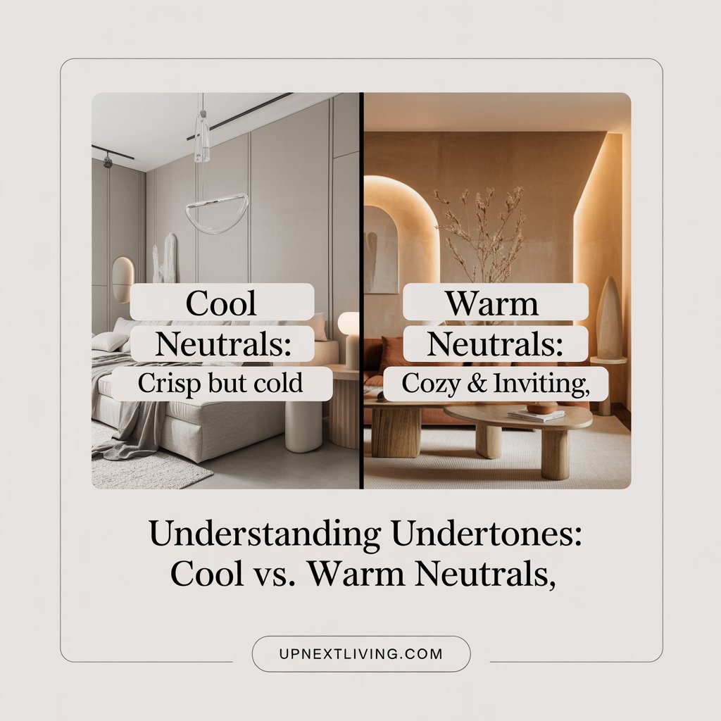
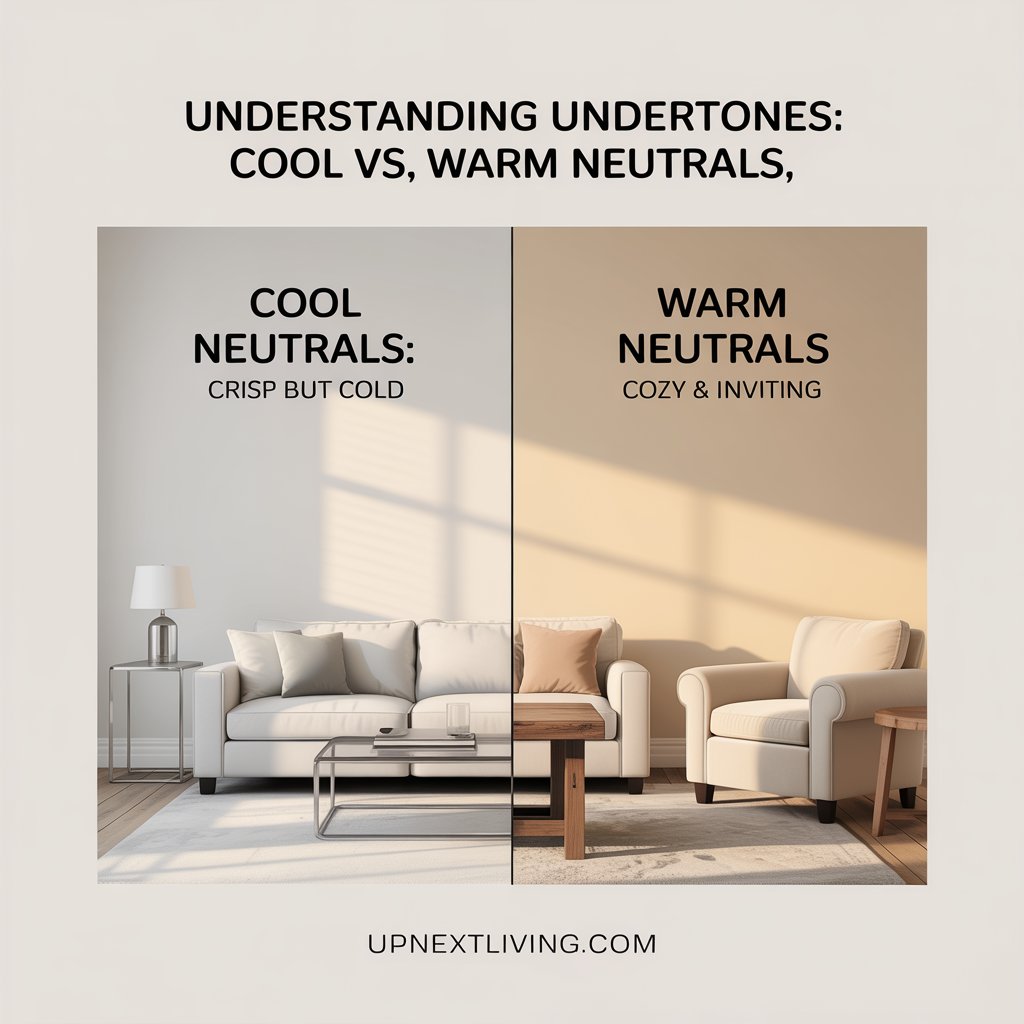
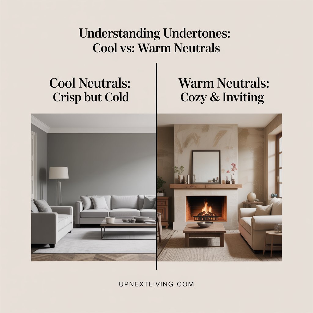
🧱 Warm vs. Cool Neutrals: What’s the Difference?
| Aspect | Warm Neutrals | Cool Neutrals |
|---|---|---|
| Base Undertone | Yellow, red, orange | Blue, green, violet |
| Mood Created | Cozy, inviting, restful | Crisp, modern, calming |
| Works Best With | Earth tones, wood, brass | Metals, modern textures, glass |
| Room Temperature Feel | Warmer in natural/LED light | May feel colder or starker |
🪑 Styling Tips: How to Make Warm Neutrals Stand Out
- Add depth with texture: Use velvet, boucle, rattan, and linen
- Use layers of light: Wall sconces, floor lamps, and candles
- Bring in nature: Add houseplants, wooden bowls, or stone vases
- Balance warm with contrast: Add dark accents like black metal frames or charcoal textiles
- Use tone-on-tone design: Play with shades of beige, taupe, and cream for dimension
🌱 Are Warm Neutrals Sustainable?
Absolutely. Many sustainable design principles align with warm neutral palettes:
- Natural materials like linen, jute, and wood pair beautifully
- Vintage and timeless pieces look better in warm-toned backdrops
- Biophilic design (using nature in interiors) blends best with earth tones
Designing with warm neutrals supports both aesthetic longevity and eco-conscious living.
📋 Warm Neutral Room Design Checklist
- Base wall color in warm beige, greige, or creamy white
- Natural materials like wood, linen, jute
- Textured elements: rugs, throws, pillows
- Soft lighting with yellow-toned bulbs
- One or two dark accents for balance
- Layered accessories in tonal shade
FAQs
What is your process working in smaller projects?
Études offers comprehensive consulting, management, design, and research solutions. Our vision is to be at the forefront of architectural innovation, fostering a global community of architects and enthusiasts united by a passion for creating spaces. Every architectural endeavor is an opportunity to shape the future.
Who is behind Études?
Études offers comprehensive consulting, management, design, and research solutions. Our vision is to be at the forefront of architectural innovation, fostering a global community of architects and enthusiasts united by a passion for creating spaces. Every architectural endeavor is an opportunity to shape the future.
I’d like to get to meet fellow architects, how can I do that?
Études offers comprehensive consulting, management, design, and research solutions. Our vision is to be at the forefront of architectural innovation, fostering a global community of architects and enthusiasts united by a passion for creating spaces. Every architectural endeavor is an opportunity to shape the future.
Can I apply to be a part of the team or work as a contractor?
Études offers comprehensive consulting, management, design, and research solutions. Our vision is to be at the forefront of architectural innovation, fostering a global community of architects and enthusiasts united by a passion for creating spaces. Every architectural endeavor is an opportunity to shape the future.
✍️ Final Thoughts: Why Warm Neutrals Matter in 2025 and Beyond
A neutral color scheme with warm undertones isn’t just a design trend — it’s a foundation for intentional living. It blends comfort, elegance, and practicality, helping you create a home that feels both timeless and emotionally nourishing.
Whether you’re redesigning a single room or your entire home, warm neutrals offer endless versatility and quiet sophistication — a trend that’s here to stay.